Here is a collection of past projects for clients in various sectors. There are examples of work for medical, engineering, estate agents, technology, finance and more.
Design Case Studies
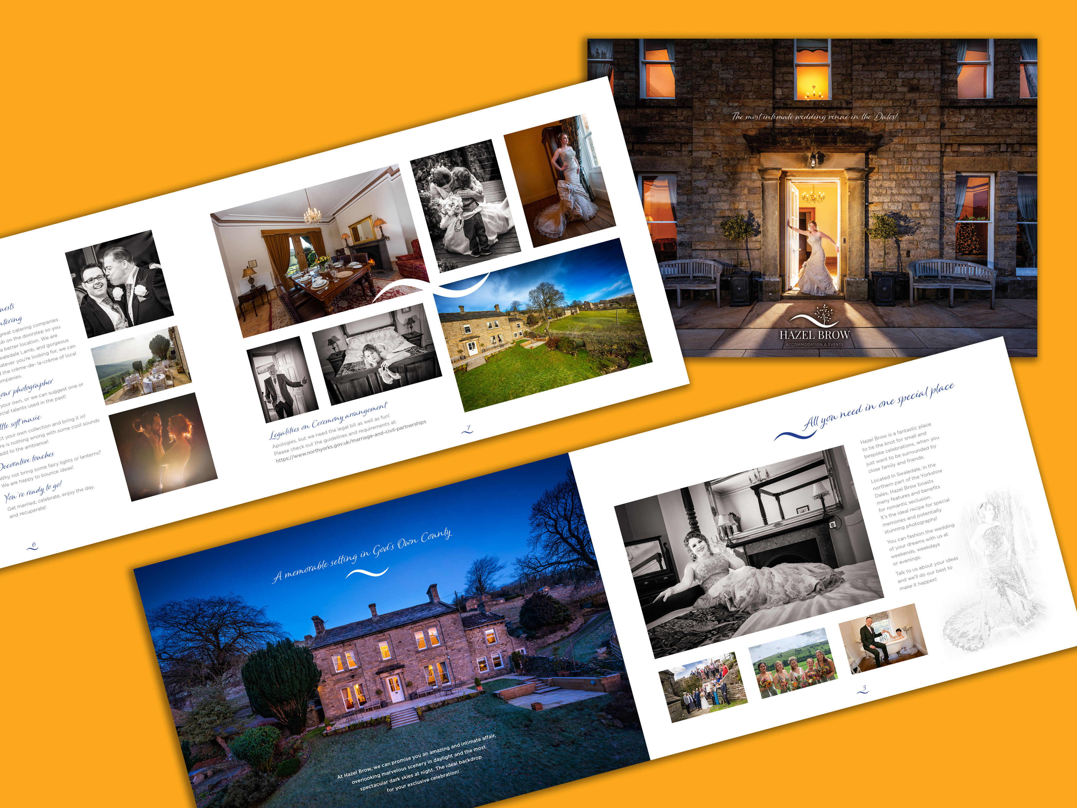
Hazel Brow Farm House
Wedding Brochure including Photo Shoot
The owners of Hazel Brow had recently gained a licence to hold weddings and needed not only the promotional material but the some photography to show the venue off to its true potential. As they had hosted only a couple of weddings, more serious quality photography was required. I was required to do everything.
A quick stylised wedding shoot was arranged and bolted onto the architectural segment that I was doing to display the house as holiday accommodation. We used one of their previous brides who volunteered to come back so we could get the shots necessary for the brochure. The branding was pre-existing.
The result is eye-catching giving a feel of exclusive quality, giving them a perfect base to build on. Also it’s more than a match for their local competitors!
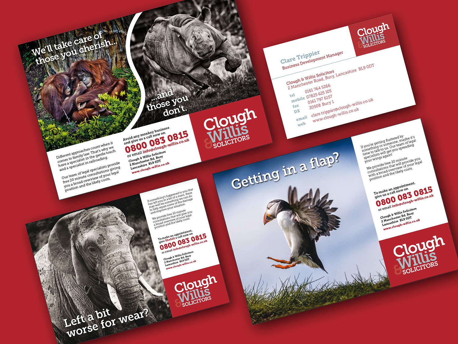
Clough & Willis Solicitors
Corporate ID and Ad Campaign
A very interesting project where the Marketing Manager of a small legal firm called Clough & Willis, first spotted my wildlife photography and thought it would be great to use as part of an ad campaign!
The brand needed a refresh too, so in the end we went the whole hog and sorted their identity from the ground up.
I wrote and designed all of the ads and my photography was used throughout, using the animals to depict the various situations that potential clients may find themselves in. The services on offer would look to remedy these problems.
Ex-Or Intelligent Lighting
Flagship MLS Product Brochure
One of my oldest clients, Ex-Or needed to update their primary product brochure after our previous version gave 7 years faithful service.
MLS is an intelligent lighting product intended for multi-floor commercial buildings. The system is complete simplicity in its usage, but its installation can be tricky to get across in lay-men’s terms.
The trick to this was breaking down the complexity of the product into easily absorbed information that doesn’t look boring. This meant looking after the reader with friendly bite size info supported with simple, but colourful illustrations and photography – all done by me!
Fulwood Hall Hospital
Corporate ID for Gynaecology Specialist Centre
An interesting exercise where following the success of the Brain & Spine Centre logo, I was asked to create other identities for several departments of Fulwood Hall Hospital. As before, they were to be clean and individual, but retaining the same symbiotic feel.
Some were pretty challenging due to the subject matter, as you can see!
The Gynaecology Specialist Centre identity is one of my proudest visual solutions, demonstrating that a good creative image can still have elegance and subtlety!
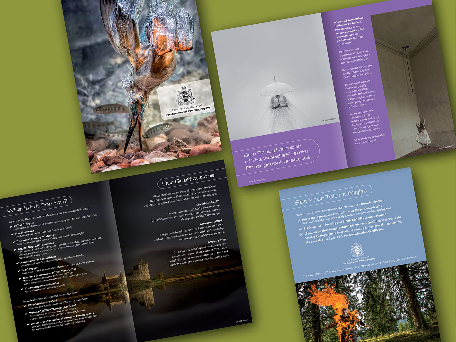
British Institute of Professional Photography (BIPP)
Revised Corporate ID, Promotional Brochure plus Documentation
Following a takeover at Board level, the BIPP needed a desperate overhaul from the ground up. As the new Chair of the Board, I volunteered over a year of my time to help with the cause.
Once we had established cost-cutting and other ways to increase revenue, I took on the task of rejuvenating the brand.
This involved revising the logo to include the original crest from 1905. Then came the official documentation for qualifications and tutoring. I redesigned and rewrote the lot.
Then my parting gift was the brochure to be used at the Photography Show 2020.
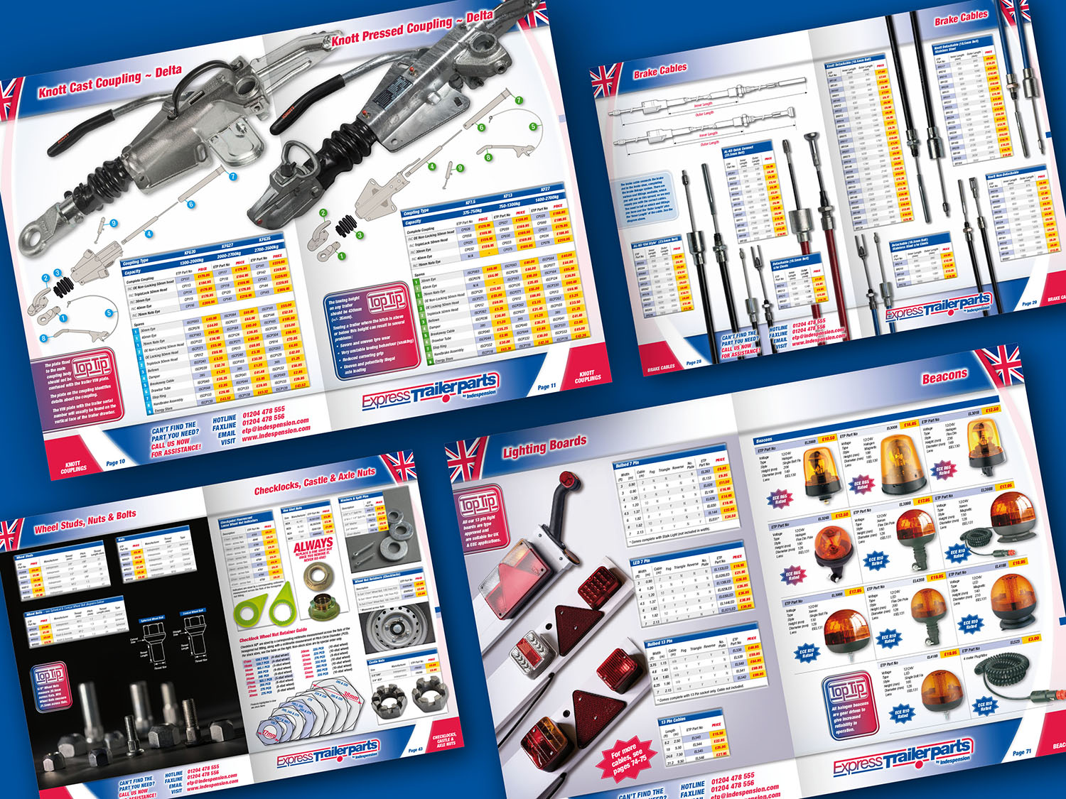
Indespension Trailers
88 Page ETP Trailer Parts Catalogue
The largest project ever undertaken by myself was recently for Indespension,
this catalogue was originally intended as solely for their Express Trailer Parts service.
Several years earlier I produced a much smaller catalogue called the Top 200,
which became a big success for Indespension. This resulted a couple of years later in competition rising from a firm called ATE, which went deeper with more products and technical advice.
The following year, my directive was to take the fight back to ATE and figuratively smash their catalogue away. I handled everything from start to finish, solely working with Indespension’s Marketing Manager and various technical representatives.
The project took 10 months to reach the end of ‘Phase Two’.
Clients praised its simplicity and usability from the off. In fact, such was the success of the catalogue, Indespension soon decided to create an Indespension only version without pricing. Also, ATE hastily modified their own catalogue using some of the ideas I had created.
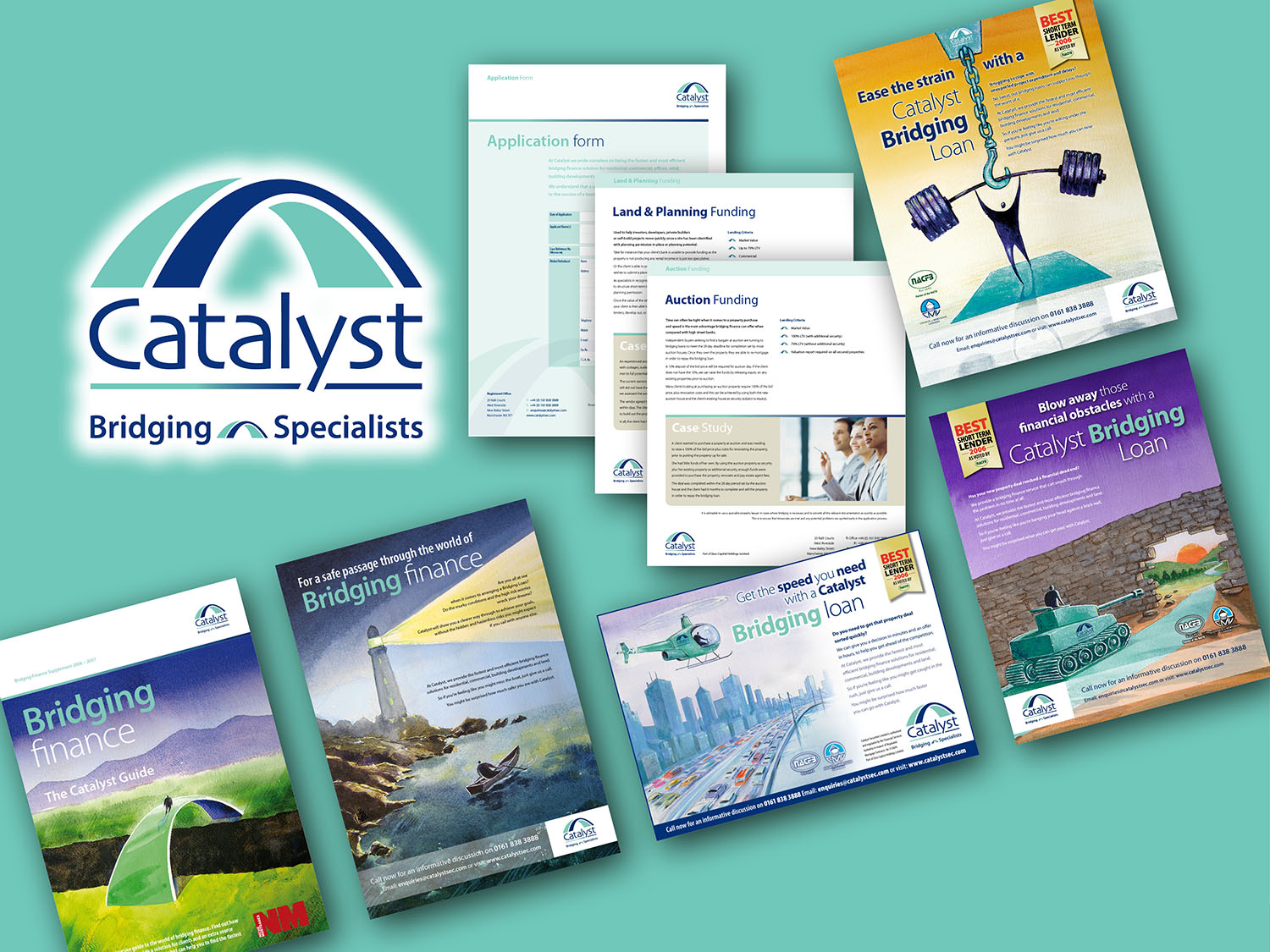
Catalyst Bridging Finance
New Corporate ID, Branding, Wallet, Inserts and Ad Campaign
Catalyst were a fine example where they already had a half decent image, but they just wanted to make it better! We were asked to recreate everything from the ground up. That’s branding, ads, literature and exhibitions.
The idea behind the advertising was to show how an investor might
use Catalyst to get past daunting situations, conveyed with various abstract scenarios and how Catalyst may assist to relieve those problems. The solution is also Catalyst coloured.
For the literature, it was decided that with so many ever changing packages supplied by financial firms, the best financial sense was to create a generic folder. The inserts become the only part that need to alter with time.
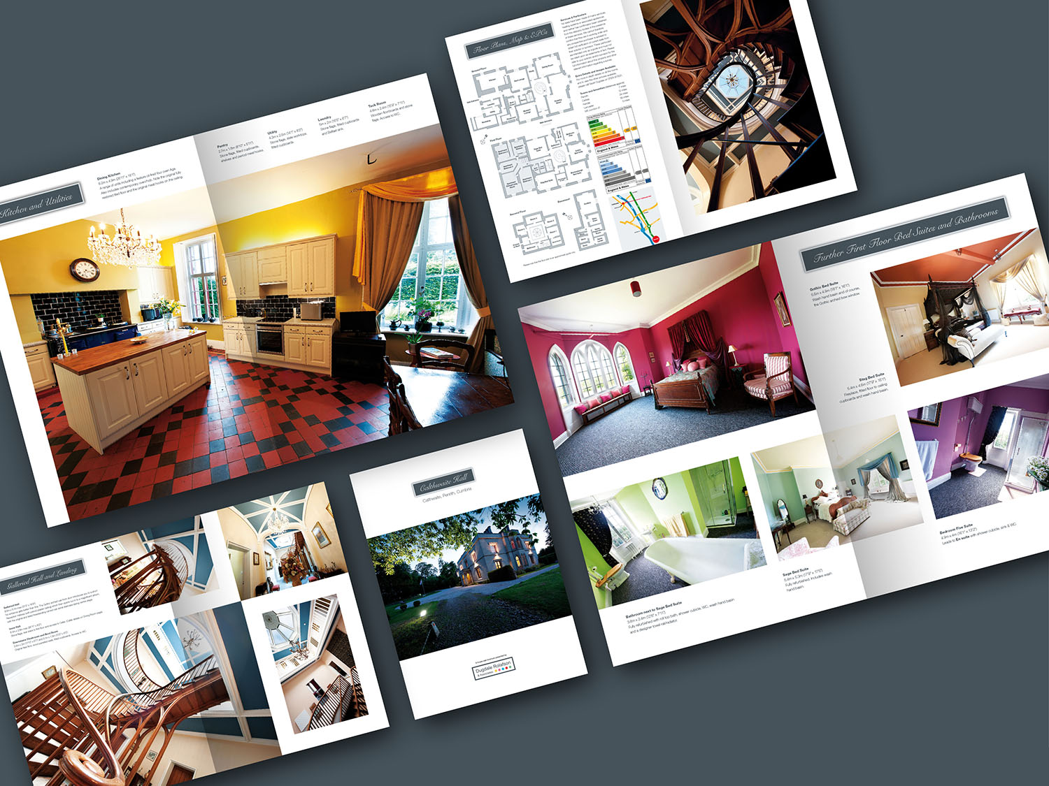
Dugdale Rolafson Estate Agents
Millionaire House Brochure Project
An interesting project where I co-worked with Dugdale Rolafson Estate Agents producing mansion sales aid brochures to test the market. So called ‘click and collect’ brochures normally produced by Estate Agents for properties were absolutely dreadful in both their photography and design execution, so we felt it was an area worth exploring.
Our idea was that larger and more exclusive properties should have something properly suitable. Yes, the cost would be higher, but if the property was a million plus, then it had to look it with its promotional material. Material that really sold the house with good photography, smart design and dare I say, readable text that didn’t stretch the whole width of the page.
The finishing touch was that the brochure was printed on quality paper with no need for glossy laminations (which still do not hide a poor design). An interesting period where the theory proved to be ahead of its time.
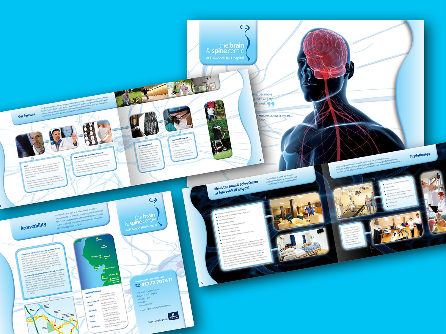
Brain & Spine Centre
Corporate ID plus Promotional Brochure
Winning Fulwood Hall Private Healthcare Hospital came as a result of my extensive work with Verna Group and all three divisions of Hartmann UK.
After completing a few minor briefs, the marketing team let me loose on a new ID and brochure for their new Brain & Spine Centre. The logo simply followed the contours of the human spine and imagery (due to budget restrictions) was supplied or photo-stocked.
This of course included my map creating skills – which is still more reliable than Google or a sat-nav! The project’s success meant I would later brand up the other departments…